
Grain Direction in Stained Glass Borders
Careful attention to grain direction can create realistic veining in leaves, suggest flowing water, or produce the illusion of a dramatic sunset. When your design includes a border, grain direction becomes just as important there as it is in the central image.
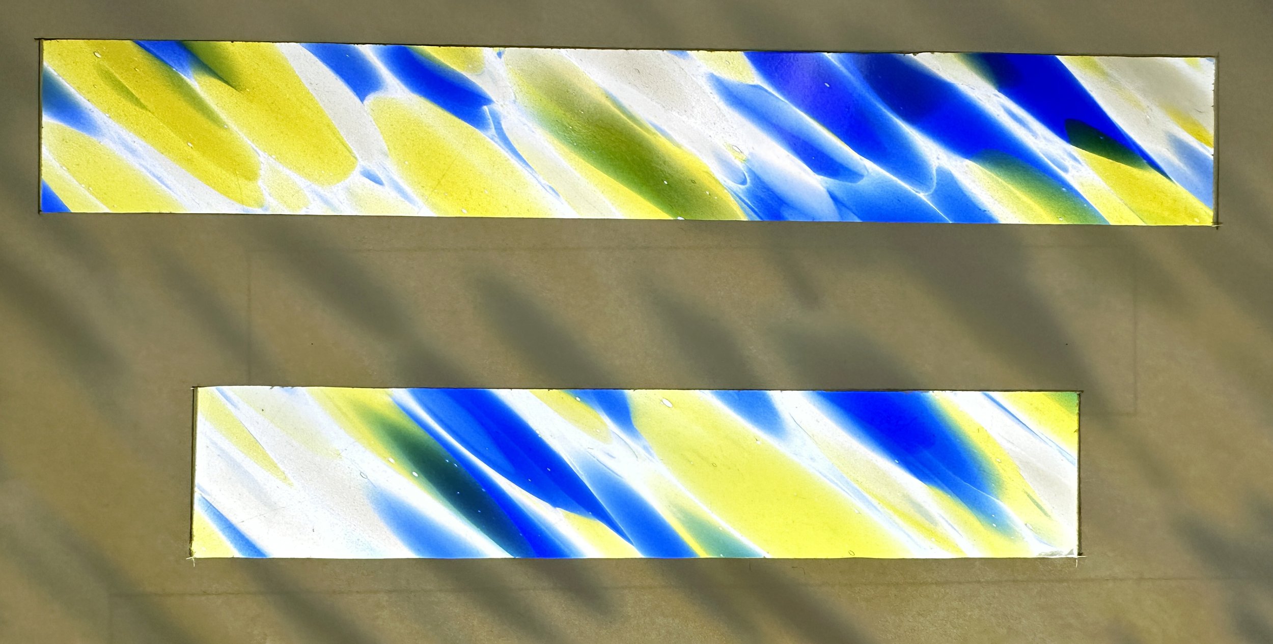
As a general rule, we recommend laying out your border glass so that the grain runs perpendicular to the long edge of each piece. This approach helps you make the most of the glass’s color variation while ensuring visual consistency throughout the border. Many types of glass contain three or more colors, and orienting the grain this way allows each border segment to display the full range of color—creating a look that feels cohesive, yet naturally varied.
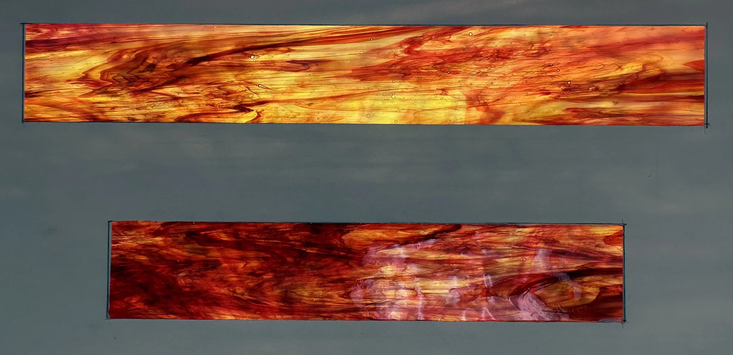
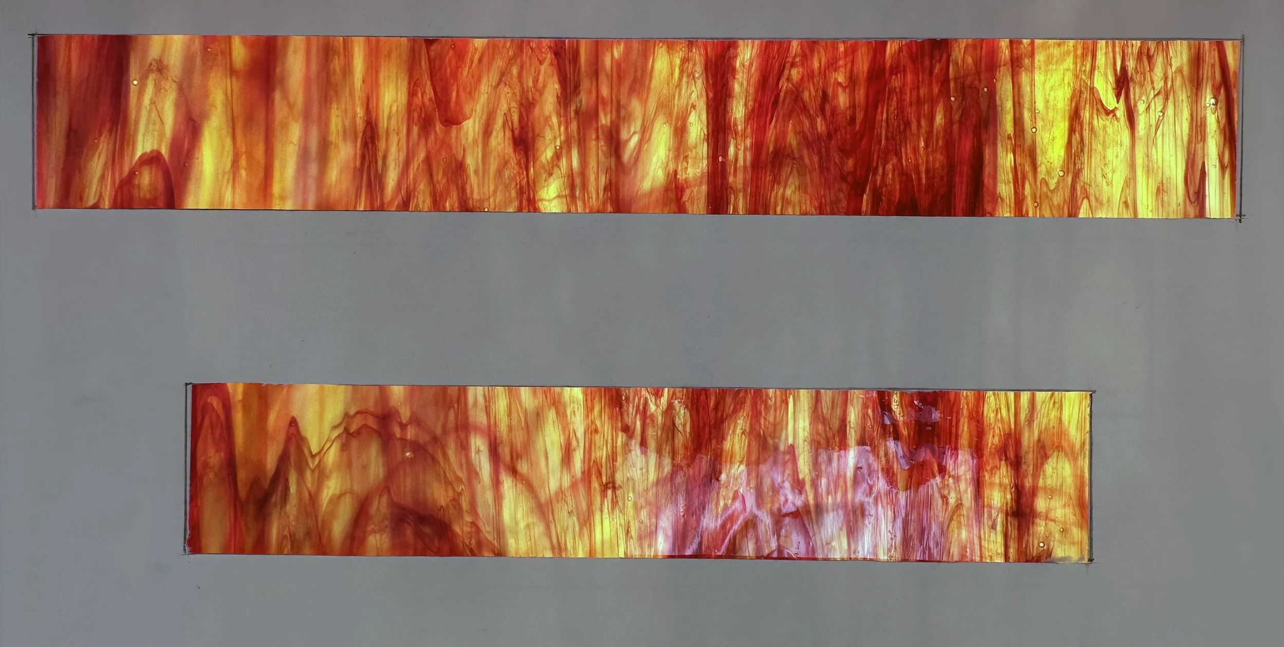
By contrast, if you orient the grain so that it runs along the length of the border pieces, you may end up with noticeable inconsistencies. Some segments may appear dominated by a single color, while others show entirely different combinations. Even when pieces are cut from the same sheet, one section may look almost entirely red (or blue, or amber), making it appear mismatched or even mistaken. In other cases, a strong streak of color might appear in only one border piece, drawing unintended attention and disrupting the overall balance.
We also generally advise against placing the grain on a diagonal in border pieces. Diagonal grain in a frame-like border can create an optical illusion that makes the central panel appear crooked—even when it is perfectly square. The result can be visually distracting and surprisingly difficult to “unsee.”
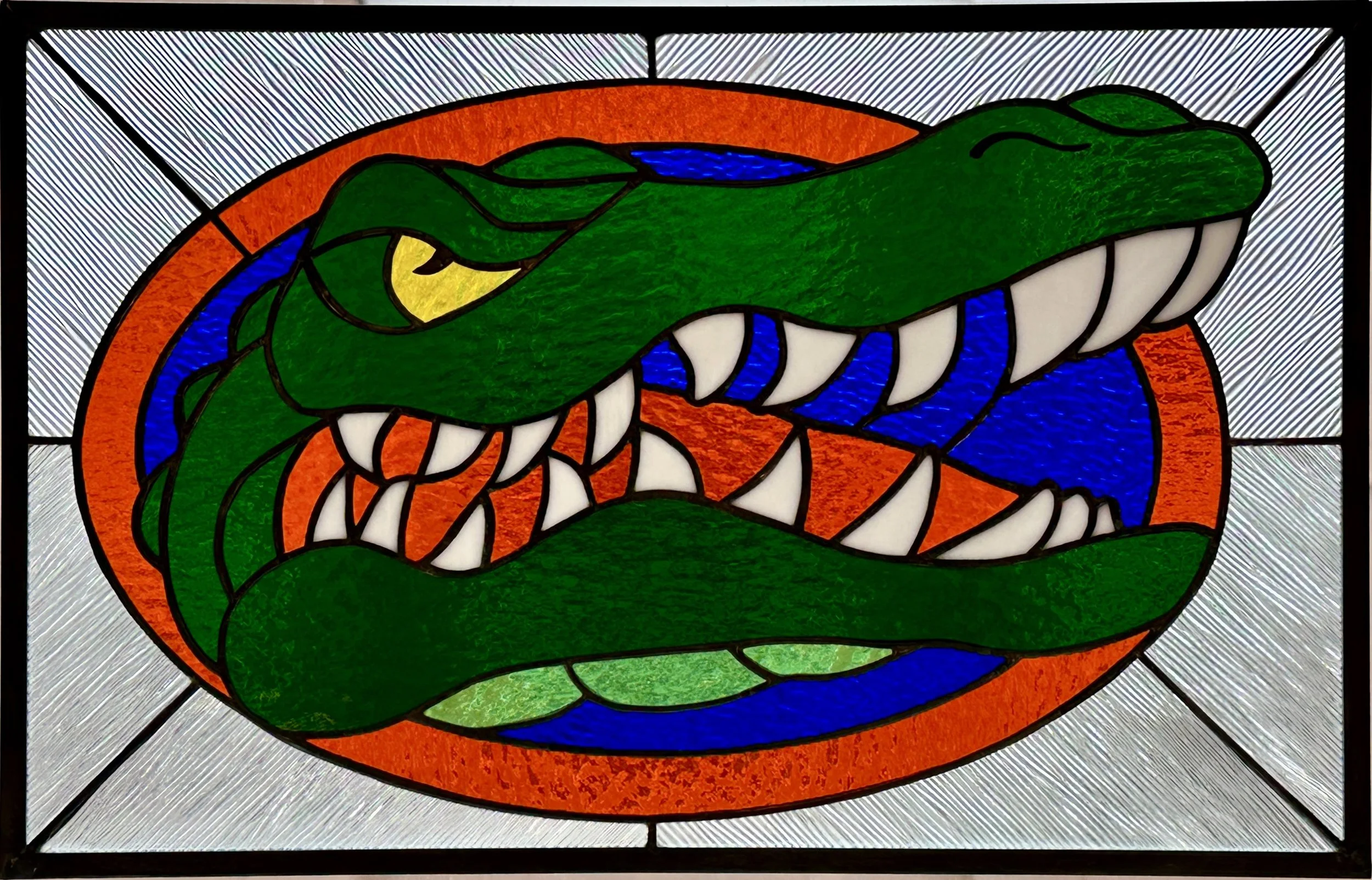
Artwork by David Lantrip
Of course, every rule has its exception. If you intentionally want a diagonal grain for design reasons, consider dividing the border visually into two mirrored halves. When the grain direction in each half mirrors the other, the pattern appears to radiate from the center. This approach can produce a bold and dynamic effect while maintaining visual harmony.